There’s no doubt that color influences our mood. Everyone is receptive to their surroundings and will immediately feel the energy created by a scarlet red kitchen, as well as the serenity elicited by a light blue room. Others may not regard the color, but the impact is nevertheless there. Color has the potential to energize, to comfort, to spark creativity, and even to arouse the appetite. Ever noticed the recurrence of red and bright yellow are used in the restaurant interiors?
With the new year, comes the chance to embrace new trends in design and so, it’s time to address the color trends that will paint this year it all its glory! Every year, Pantone has revealed the colors for the coming year, to cross over interior design, fashion, interior design products, and graphic design applications. Leatrice (Lee) Eiseman, executive director of the Pantone Color Institute, shared ten very varied color palettes the company predicts will share the spotlight in 2017.
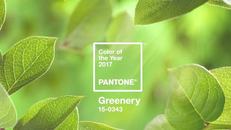
Pantone designed an assortment of 10 palettes matching it with neutrals, pastels, brights, deeper tones, metallics, and including the two 2016 colors of the year, Rose Quartz, and Serenity. So what is the color of the year?
The company has picked a color that echoes the current artistic climate this year. In 2017, the color will historically shape the trends in all aspects of design—architecture, interior design, interior-exterior décor, fashion, food, travel, beauty—the list never ends.
A freshening and re-energizing shade, Greenery is symbolic of fresh starts. Symbolic of blooming foliage and the lushness of the glorious outdoors, the securing attributes of Greenery omens consumers to take a deep breath, relax and revitalize.
The more immersed people are in modern living, the higher their intrinsic desire to absorb themselves in the physical beauty and internal unity of the natural realm. This transformation is shown by the reproduction of all things indicative of Greenery in everyday lives through architecture, lifestyle and design selections globally. Greenery is now being stretched to the forefront – it is an omnipresent hue throughout the world and in 2017, we are likely to see it all over, and all around us.Greenery is not a “green with envy” shade, unlike 2013’s color of the year, Emerald, which signified luxury. Greenery truly hits into the counter: minimalism.
What comes to mind when thinking of Greenery as the color of the year are all the “re” words: revive, rejuvenate, renovate, revitalize, recharge, reform, renew, reinvigorate, re-oxygenate. And these are the words that will be the basis of design concepts throughout 2017. Who knows, this trend might even last longer than the year ahead!
As your trusted sourcing partner, we will ensure that our expert China sourcing agents will be well versed with Pantone’s declarations, and assist you in every way to procure products that will make your designs come to life – in conjunction with Greenery being the life (or color) of top-class, and style rich designs that you muster up. Get in touch with us for all your China sourcing needs as well as design inspirations that are in tune with the color of 2017!


Leave a Reply