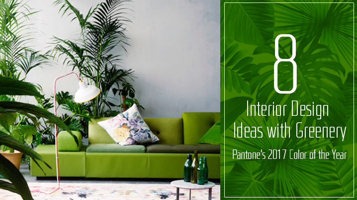
Pantone Color Institute has announced its Color of the Year for 2017, and Greenery (15-0343) has already developed a huge fan base among design enthusiasts and professionals.
Greenery is extremely versatile, and Pantone’s calling it “Nature’s Neutral” for good reason. It pairs perfectly with wood tones and core neutrals, as well as reds, oranges, yellows and blues. Inspired by sunlit green grass and light spring foliage, this natural and refreshing color takes “green design” a step further!
Looking for interior design inspiration that incorporates Greenery? Here’s what to do:
1. Focal Elements

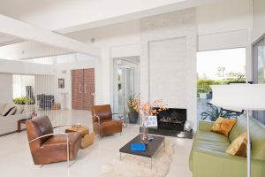
This vibrant and welcoming hue is perfect for bold focal pieces, e.g. a large couch or area rug in an otherwise muted space. It grabs attention, drawing the eye to any section you’d like to accentuate. You could also use it to paint the front door, for a unique and funky touch!
2. Tiles and Walls
Use this invigorating tone to create accent walls and ceilings anywhere in the home. A tiled backsplash in various shades of green adds personality to a kitchen, while stained glass windows or mosaic frames instantly make bathrooms feel more stylish and refreshing.
3. Accent Pieces

If you think Greenery is too intense for a focal piece, use it in smaller doses (paired with sober neutrals) instead. Breathe life into armchairs, side chairs or coffee tables in living rooms, headboards in bedrooms, painted stools or chairs in kitchens and dining areas, etc.
4. Décor and Linens
Splashes of bold color are a terrific way to bring new life to practically any room, especially when they’re paired with core neutrals. Use Greenery in decorative accents like throw pillows, small rugs, window treatments, picture frames, light fixtures, artwork and more.
5. Fresh Greenery

There’s no better way to incorporate Greenery in your interior décor than by bringing the outdoors in. Whether you want to create a lush green paradise indoors or just place a few fresh plants around your space, get this nature-inspired hue right from the source!
6. Faux Greens
Even if you don’t have a green thumb, you can add pops of color to any area of your home with faux leaves and foliage. Think seasonal wreaths or mantle displays in this the beautiful yellow-green hue, verdant aquarium fillers, lush sprays of faux ferns, or floral arrangements.
7. Workspaces

Pantone’s 2017 Color of the Year isn’t just perfect for homes, but also offices, commercial properties and business establishments. Whether you’re designing a home office or a shared workspace, Greenery enhances morale and productivity by keeping it from looking cold and sterile.
8. Children’s Areas
As a gender-neutral hue, Greenery is ideal for children’s bedrooms, playrooms, outdoor play areas and other kid-friendly spaces. It’s fresh, warm and vibrant, offering a boost of creativity and energy during the day as well as restfulness after the sun goes down.
If you’re working on a design project, a China sourcing agent like Excella Worldwide can help you find trendy décor and materials in the colors of your choice. Contact us to learn more!


Leave a Reply